Someone designed this
Why bad UX is often a business decision, not a design failure.
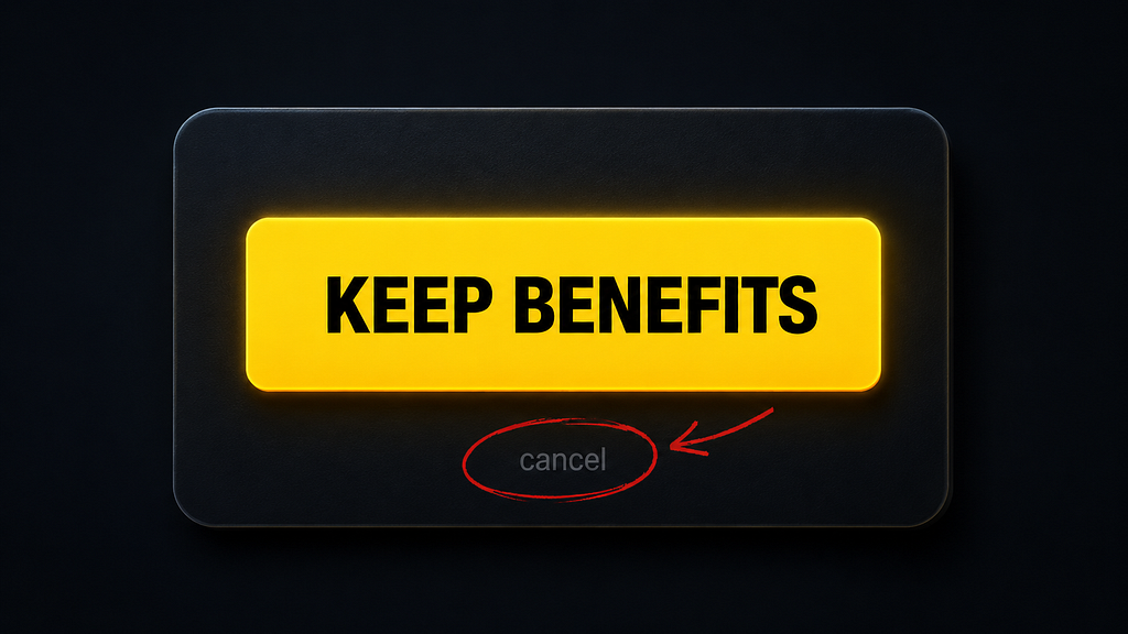
There’s a screen most people have seen at least once.
You’re trying to cancel a subscription. You’ve made up your mind. You click the button that looks like it starts the process.
And then something strange happens.
The page…